THE SERVICES
Naming
Branding
Visual Identity
Website
THE STORY
Head South Productions is a full-service production company founded by industry expert producers in the Gulf of Mexico. With the necessity to stand out and reach broader audiences to attract them to make their productions in Mexico, they approached Casa Anomalías to construct from the ground up their exciting project.
KEY BRIEF NOTES
“The happiness and satisfaction of our client is our biggest priority. We excel at solving all their production needs at the same time that we give them a good time and make them feel welcomed.”
THE NAME
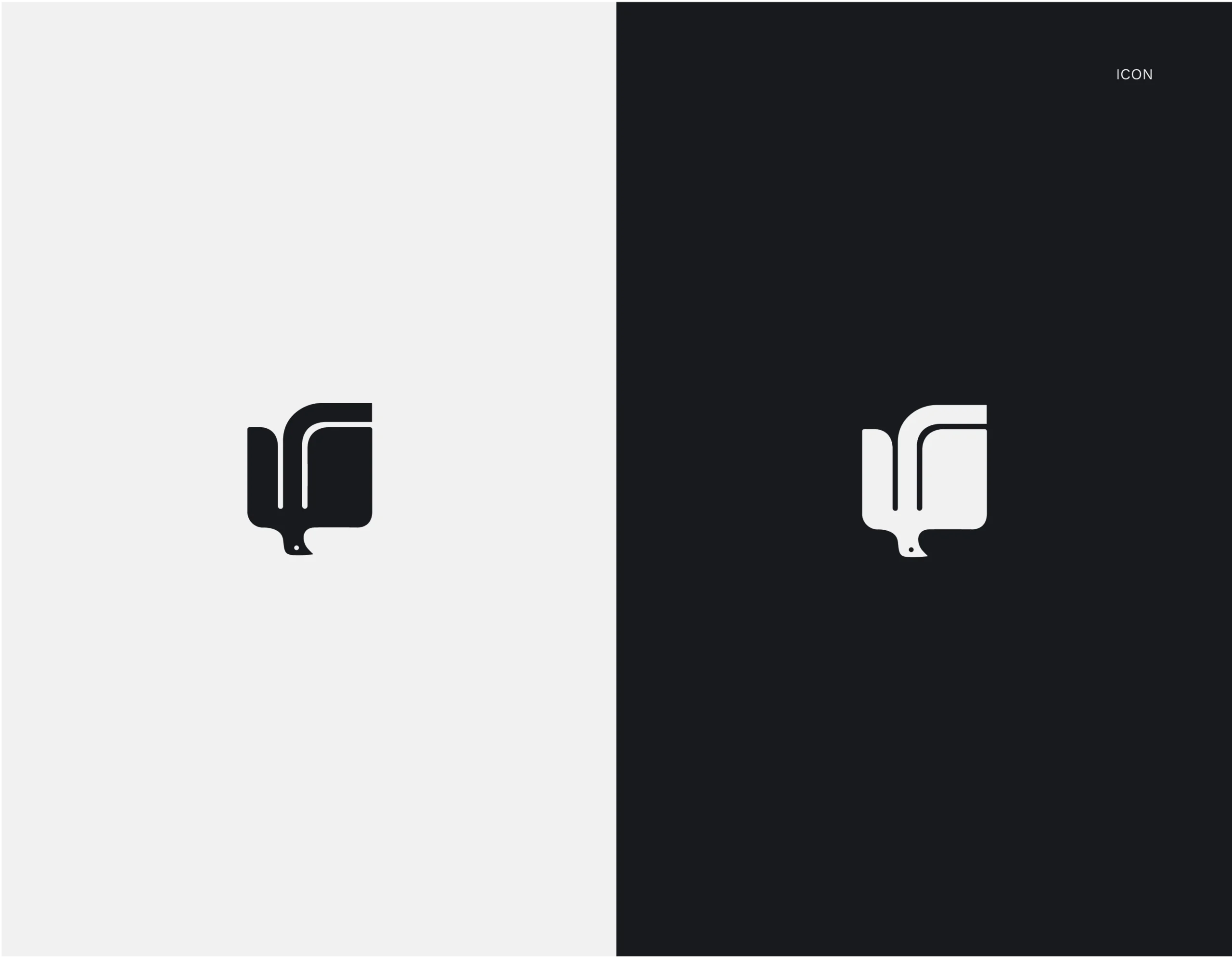
The name Head South alludes to the distinctive characteristics that come with carrying out a production in Mexico: the warmth of the Mexican crew, the beauty of the locations, the exceptional attention to detail and the accessibility to all the needed resources. Head South is a literal invitation that refers to the geographic location (as understood by their target audience) of Mexico and Latin America as the south. Inspired by the migration of birds to warmer lands during the winter, the whole identity of Head South invites the target audience to understand the South as an ideal place to be.
THE SLOGAN AND MANIFESTO
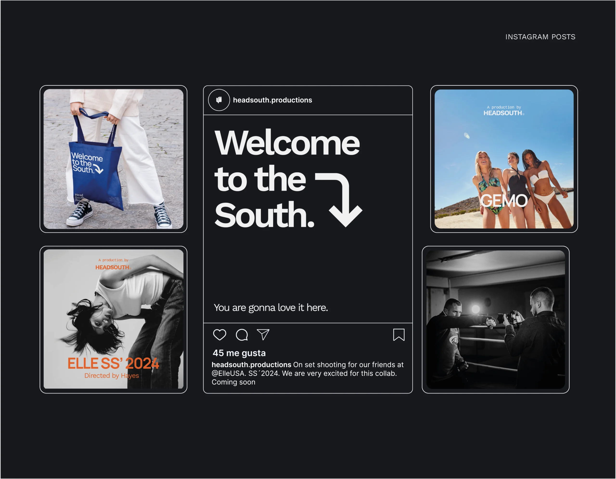
The slogan Welcome to the South feeds the understanding of the South as a place to be as well as a state of being. As customer service is one of the main priorities of Head South, it was important to make the tone of voice friendly, confident and welcoming. Sort of as if you had just stepped into an idyllic world where things get done while you also have fun, the crew greets every project with an eager: Welcome to the South!

THE GRAPHIC IDENTITY
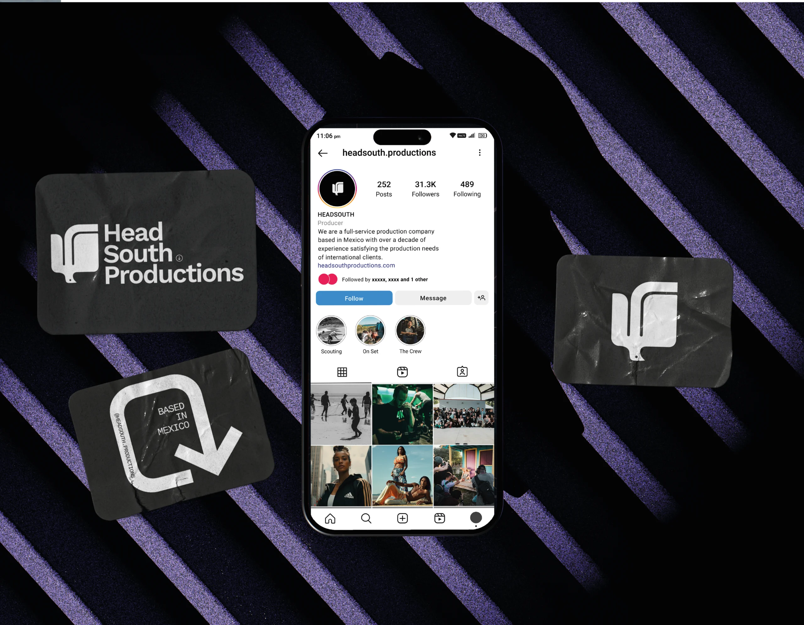
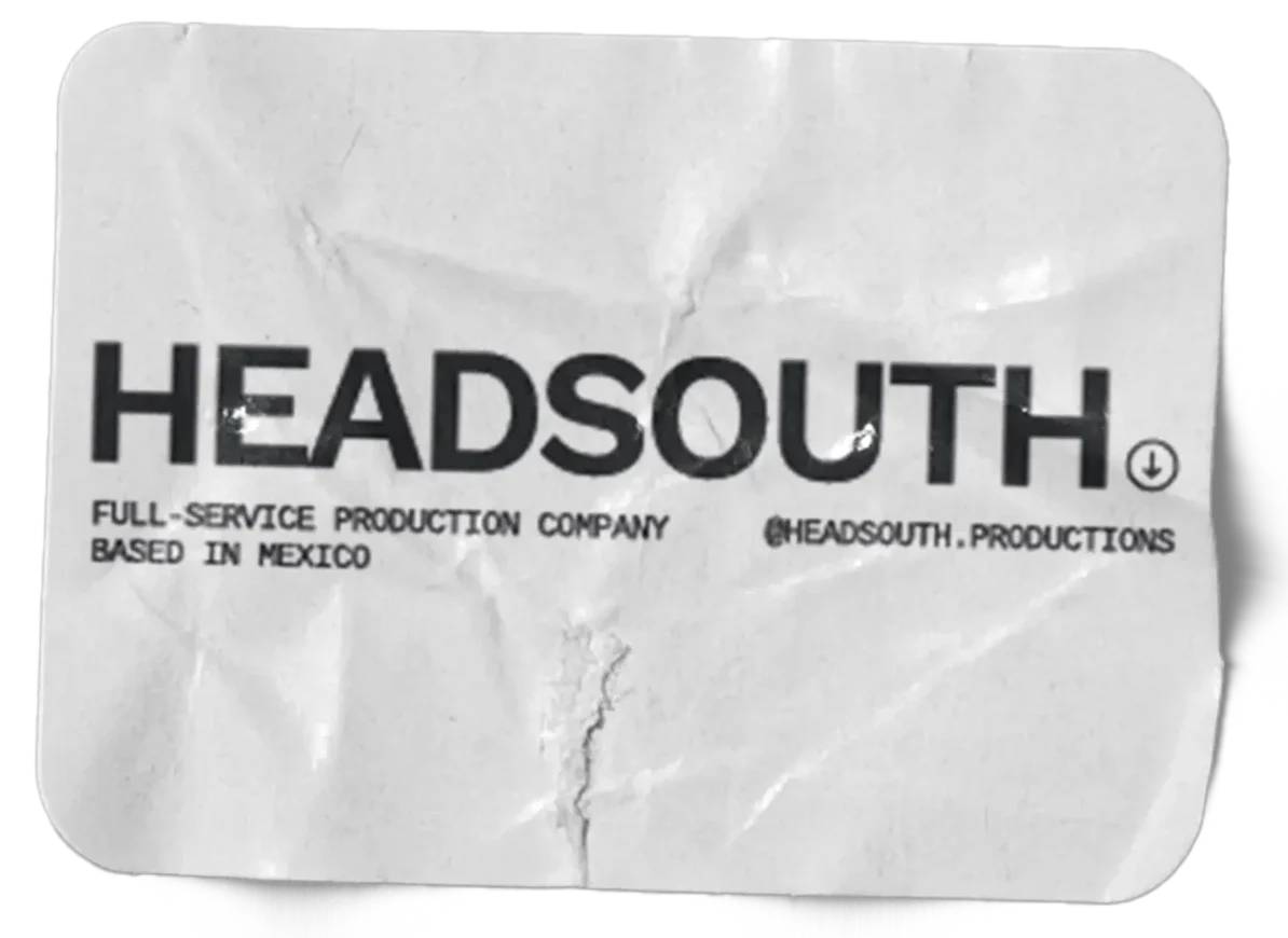
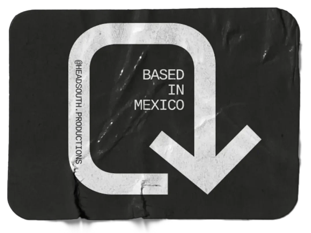
Head South’s graphic identity is based on the narrative of bird migration and the downward directionality from the semiotics of South. The logo was created with three variations that complement the diversity of projects that the clients might take on, including a stacked, a linear and an all-caps version. The colour palette, predominantly monochrome, sparingly includes bright blue and orange hues to highlight small details that characterize the brand’s identity.
KEY CLIENT FEEDBACK
“We want to express the pride of where we come from without resourcing cliché elements of what is considered Mexican. For us, our identity is expressed through our warm way of being and characteristic hospitality.”
