THE SERVICES
Naming
Branding
Visual Identity
Photography
THE STORY
Pannie is a baker with years of experience mastering the art of sourdough bread. She recently decided she was ready to go big and set up her dedicated baking space in the heart of Merida, Mexico. Pannie is not a regular baker, she is a cool baker. She needed a brand that she could identify with, one that would showcase her most authentic self and highlight her bread’s bold nature. She also wanted to pivot away from the overly refined and serious artisanal baker look and portray her wild personality through her brand’s image and tone of voice.
KEY BRIEF NOTES
“My bakery is more than just bread. It is a laboratory where there is life, there is history, there are friends, family, and there is a lot of experimentation.”
THE NAME
The name “Más Allá” (Beyond) alludes to the realization that there are more than just basic ingredients to the creation of bread. As an art form, bread has transformed Pannie’s life and her clients’ through deeper exploitation of their senses and taste buds. The power to explore beyond the known flavours and create new expressions that encapture the rich culture surrounding the baker’s upbringing inspires her to think of her craft as an infinite laboratory of creation with infinite possibilities. There is more beyond just bread.
THE SLOGAN AND MANIFESTO
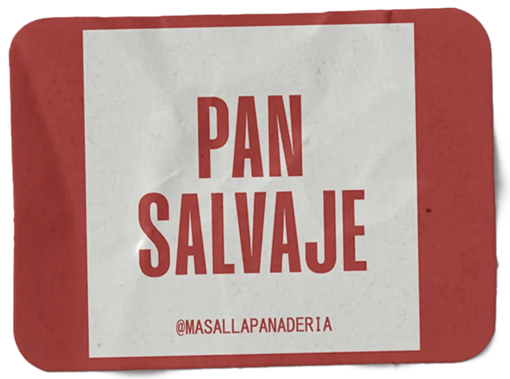
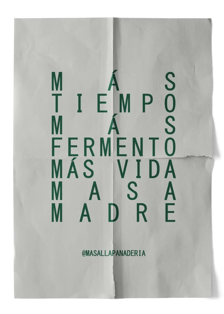
If we had to decide on only one adjective that perfectly describes the personality, spark and fearfulness of Pannie’s creations it would be wild. “Pan Salvaje” or Wild Bread is Pannie’s distinctive among her competition. The quality of her bread synergizes with the bold flavours and textures within it, completing a meticulously crafted wild experience. The slogan “Panadería con vida” or Alive Bread compliments the analogy of the afterlife that comes with the concept of the beyond. This way, bread is not only a participant, but a character in this story; bread is full of life, personality, intentions and personal development. Hence Más Allá’s manifesto: More time, more ferment, more life, more sourdough (Más tiempo, más fermento, más vida, masa madre)


THE GRAPHIC IDENTITY
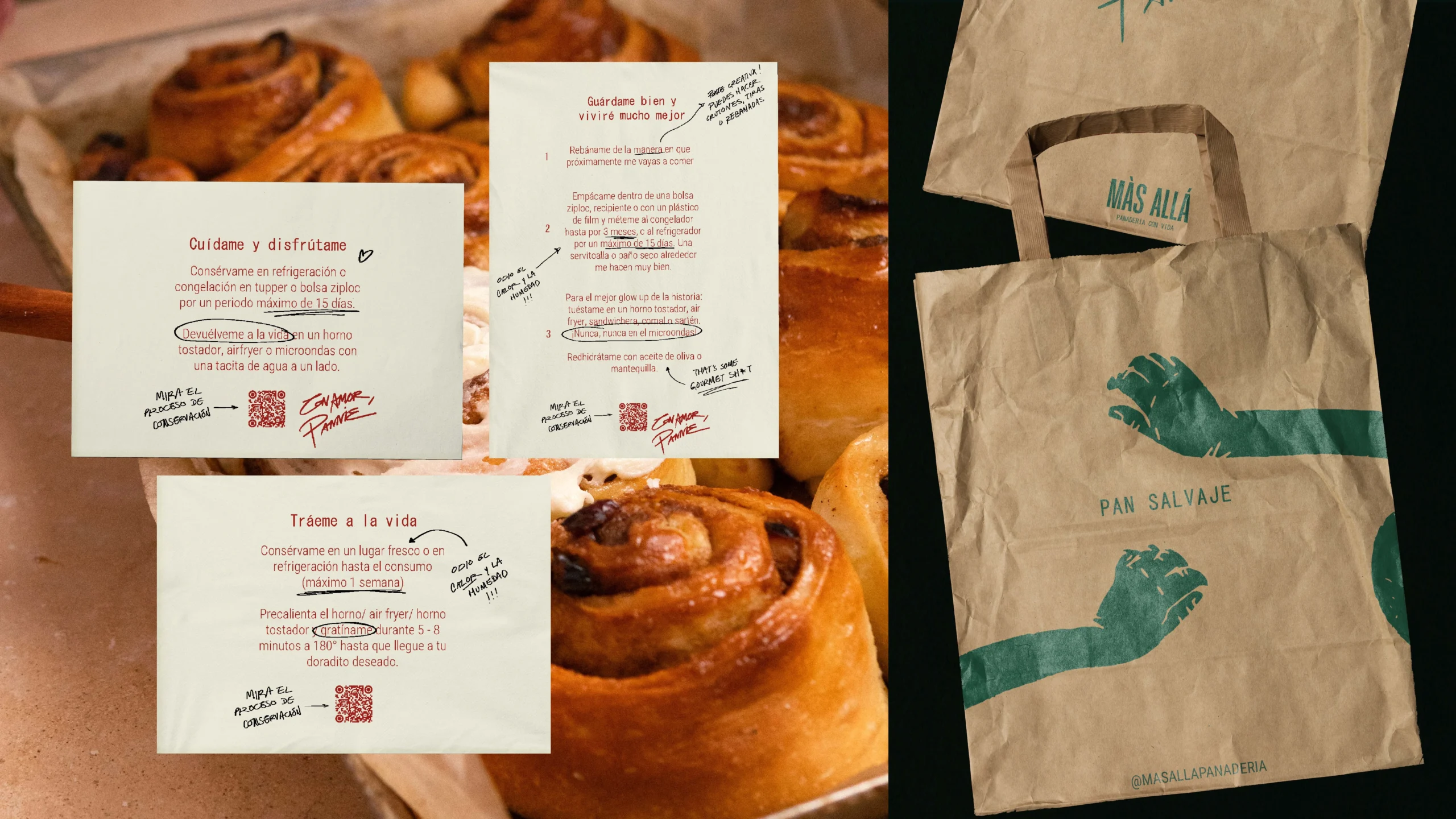
Más Allá’s graphic identity had to complement the narrative developed in the branding process, accurately portraying the playfulness, boldness and creativity that accompanies the processes of their creator. The floating hands, one of the main graphic elements of this identity, represent characters from the beyond that exist to bring to life Pannie’s sourdough visions.
Pannie is a natural-born rockstar. You can almost be certain that your baked goods were created while she was listening to Pink Floyd and daydreaming about her newest flavour combinations. Her brand needed to express exactly that magic.
KEY CLIENT FEEDBACK
“I make all my creations with love and passion. Sourdoughs, oils, jams, butters, seasonings, you name it. They are ideated, cooked and delivered by my own hands, that’s why they are so personal to me. That’s why I always sign off with: Con amor, Pannie”


PHOTOGRAPHY
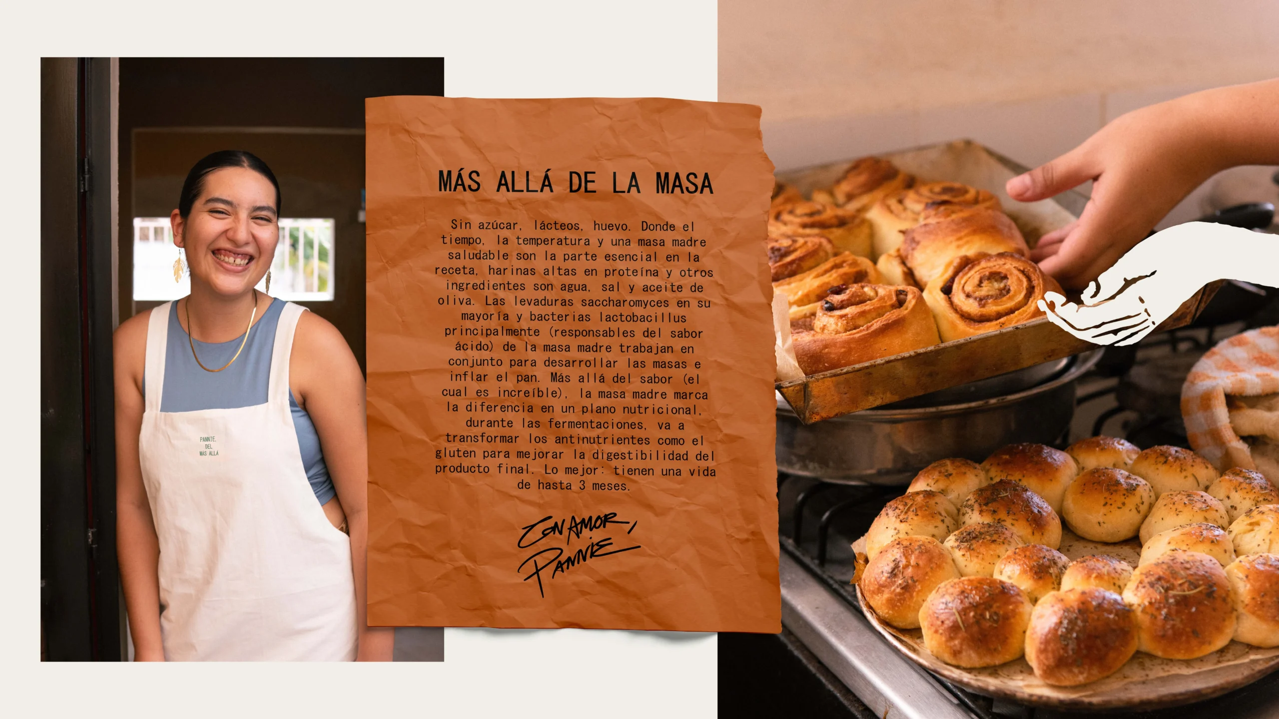
Casa Anomalías also took the task of taking the perfect pictures for Más Allá’s visual identity and socials. The key features? Texture. Color. Home. Repeat.
FOLLOW PANNIE’S PROJECT